데이터프레임 시각화
1. 필요한 라이브러리 import
# -*- coding:utf-8 -*-
import streamlit as st
import pandas as pd
import seaborn as sns
import matplotlib.pyplot as plt

import plotly.graph_objects as go
from plotly.subplots import make_subplots
2. 함수 작성 : 데이터프레임 불러오기, 요약 metrix 보여주기
def main():
## 데이터 프레임
st.title('데이터 프레임')
df = sns.load_dataset('iris')
st.dataframe(df.head(50)) #옵션이 다양함, documents 참고
st.write(df.head(50))
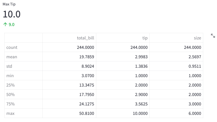
## metric(전체 요약 현황판; 보통 대시보드 상단에 배치)
tips = sns.load_dataset('tips')
tip_max = tips['tip'].max()
tip_min = tips['tip'].min()
st.metric(label = "Max Tip", value = tip_max, delta= tip_max - tip_min)
st.table(tips.describe())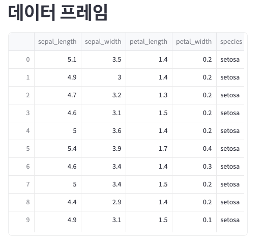
3. 시각화 라이브러리 활용하기 : matplotlib, seaborn, plotly
## visualization with matplotlib
# 남여 데이터 구분
m_tips = tips.loc[tips['sex'] == 'Male', :]
f_tips = tips.loc[tips['sex'] == 'Female', :]
st.dataframe(f_tips)
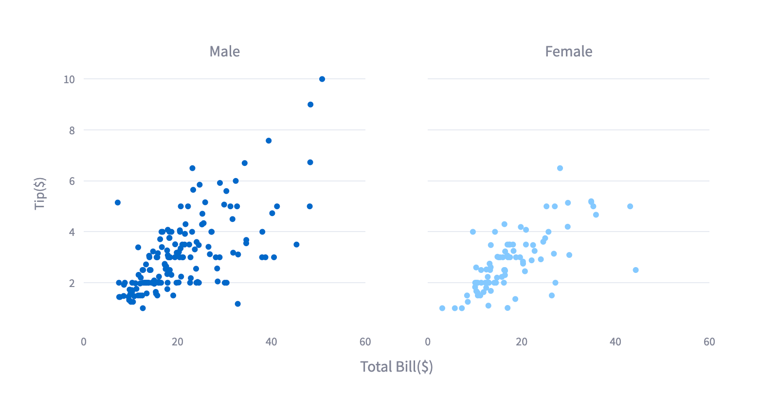
fig, ax = plt.subplots(ncols=2, figsize=(10, 6), sharex=True, sharey=True)
ax[0].scatter(x = m_tips['total_bill'], y = m_tips['tip'])
ax[0].set_title('Male')
ax[1].scatter(x = f_tips['total_bill'], y = f_tips['tip'])
ax[1].set_title('Female')
fig.supxlabel('Total Bill($)')
fig.supylabel('Tip($)')
st.pyplot(fig)
#구분선 긋기
st.write('*' * 50)
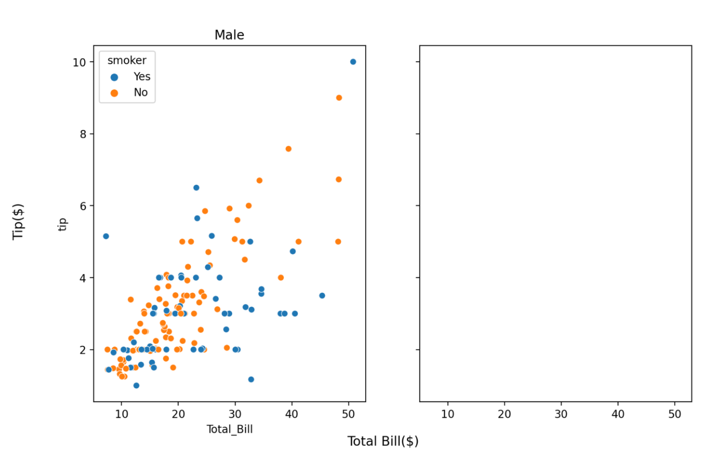
## visualization with seaborn
# 남여 데이터 구분
m_tips = tips.loc[tips['sex'] == 'Male', :]
f_tips = tips.loc[tips['sex'] == 'Female', :]
fig1, ax = plt.subplots(ncols=2, figsize=(10, 6), sharex=True, sharey=True)
sns.scatterplot(data= m_tips, x = 'total_bill', y = 'tip', hue= 'smoker', ax= ax[0]) #이것만 sns 코드
ax[0].set_title('Male')
ax[0].set_xlabel('Total_Bill')
fig1.supxlabel('Total Bill($)')
fig1.supylabel('Tip($)')
st.pyplot(fig1)
st.write('*' * 50)
## visualization with plotly
fig = make_subplots(rows = 1,
cols = 2,
subplot_titles=('Male', 'Female'),
shared_yaxes=True,
shared_xaxes=True,
x_title='Total Bill($)'
)
fig.add_trace(go.Scatter(x = m_tips['total_bill'], y = m_tips['tip'], mode='markers'), row=1, col=1)
fig.add_trace(go.Scatter(x = f_tips['total_bill'], y = f_tips['tip'], mode='markers'), row=1, col=2)
fig.update_yaxes(title_text="Tip($)", row=1, col=1)
fig.update_xaxes(range=[0, 60])
fig.update_layout(showlegend=False)
# Display visualization
st.plotly_chart(fig, use_container_width=True)
if __name__ == "__main__": #실행관련 문법
main()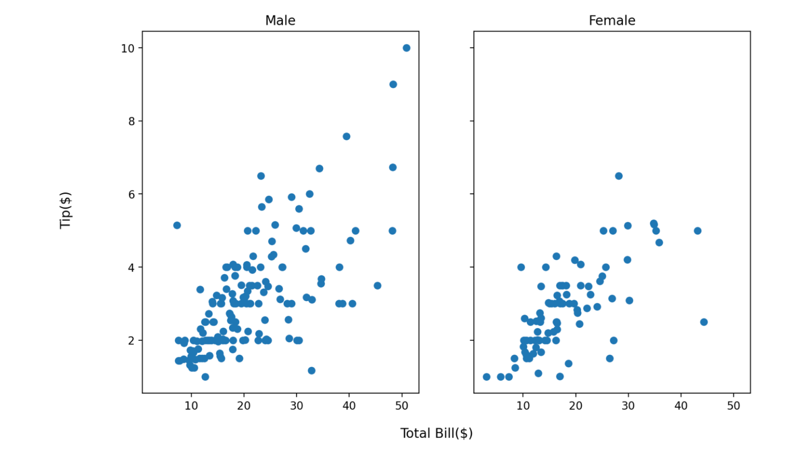
728x90
'Streamlit' 카테고리의 다른 글
| Streamlit 기본 문법(6) : selectbox(셀렉트박스) 위젯 (0) | 2023.07.28 |
|---|---|
| Streamlit 기본 문법(5) : radio(라디오) 위젯 (0) | 2023.07.28 |
| Streamlit 기본 문법(4) : checkbox(체크박스) 위젯 (0) | 2023.07.28 |
| Streamlit 기본 문법(3) : slider, button 위젯 활용하기 (0) | 2023.07.28 |
| Streamlit 기본 문법(1) (0) | 2023.07.28 |


