
target 항구인 울산항의 데이터를 종합하여 EDA 시행
01. 단순 EDA
- 접안 대기시간 유무
- 선박 용도별 접안대기 발생 비율
- 선박 용도별 접안 대기시간 평균
- 선박 용도별 대기율(방문순)
- 계선장소별 접안대기 발생비율(상위 10개)
- 상관 분석 Heatmap과 수치
(1) 접안 대기시간 유무
👉 전체 입항건 중 20%만 대기를 가지는 것으로 확인
# '접안_대기시간_분' 열이 0인 데이터와 0이 아닌 데이터의 갯수 계산
count_zero = (df['접안_대기시간_분'] == 0).sum()
count_non_zero = (df['접안_대기시간_분'] != 0).sum()

# Pretty colors
colors = ['#FF9999', '#66B2FF']

# 막대 그래프 그리기
bars = plt.bar(['zero', 'Non-zero'], [count_zero, count_non_zero], color=colors)

# 각 막대 위에 숫자 표시
for bar in bars:
    yval = bar.get_height()
    plt.text(bar.get_x() + bar.get_width()/2, yval, round(yval, 1), ha='center', va='bottom')

plt.title('접안 대기시간 유무')
plt.xlabel('zero or non-zero')
plt.ylabel('데이터 수')
plt.show()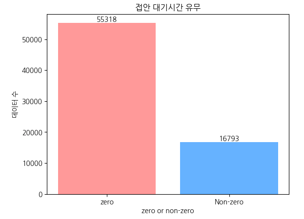
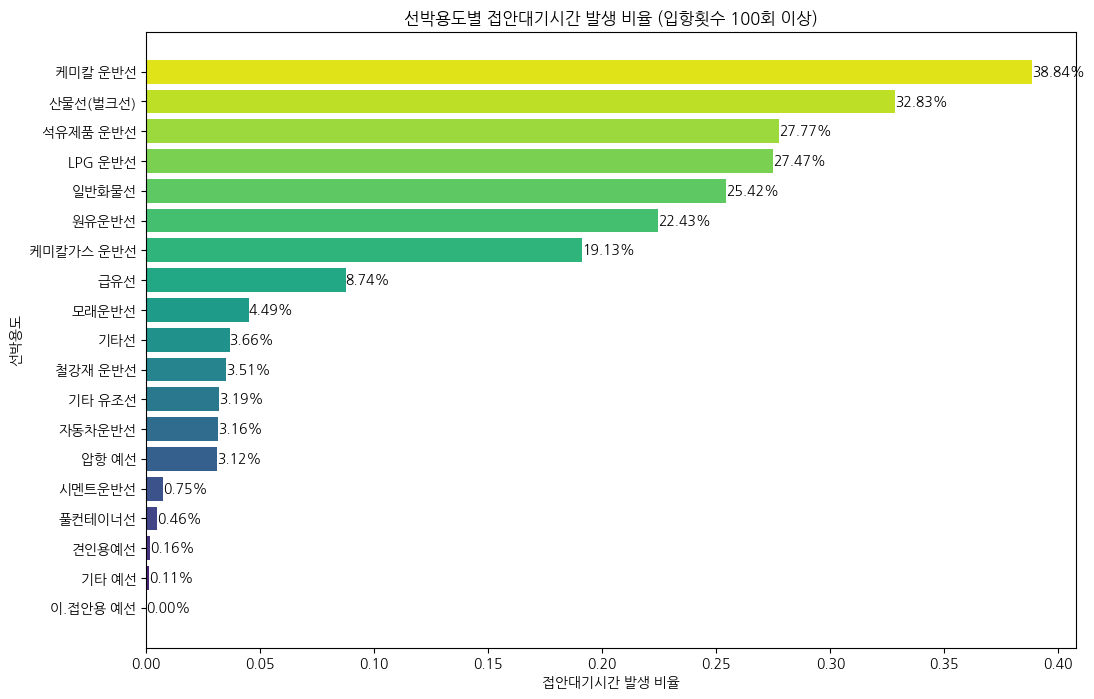
(2) 선박 용도별 접안대기 발생 비율
👉 여객선과 액체화물선 위주로 대기가 자주 발생하는 것으로 파악
(선박용도별로 100번 이상 입항한 선박에 대한 분석만 시행)
import matplotlib.pyplot as plt
import seaborn as sns

# Filter out rows with counts less than 100
filtered_df = df.groupby('선박용도').filter(lambda x: len(x) >= 100)

# 선박용도별로 접안대기시간이 발생하는 행의 비율 계산
usage_waiting_rate = filtered_df.groupby('선박용도')['접안_대기시간_분'].apply(lambda x: (x > 0).sum() / len(x)).reset_index()
usage_waiting_rate.columns = ['선박용도', '접안대기시간_발생_비율']

# 내림차순 정렬
usage_waiting_rate = usage_waiting_rate.sort_values(by='접안대기시간_발생_비율', ascending=True)

# 청록색 계열의 색상 설정
colors = sns.color_palette('viridis', len(usage_waiting_rate))

# 수평 막대 그래프 그리기
plt.figure(figsize=(12, 8))
bars = plt.barh(usage_waiting_rate['선박용도'], usage_waiting_rate['접안대기시간_발생_비율'], color=colors)

# 데이터 비율 표시
for bar, rate in zip(bars, usage_waiting_rate['접안대기시간_발생_비율']):
    plt.text(bar.get_width(), bar.get_y() + bar.get_height() / 2, f'{rate:.2%}', ha='left', va='center')

plt.xlabel('접안대기시간 발생 비율')
plt.ylabel('선박용도')
plt.title('선박용도별 접안대기시간 발생 비율 (입항횟수 100회 이상)')
plt.show()
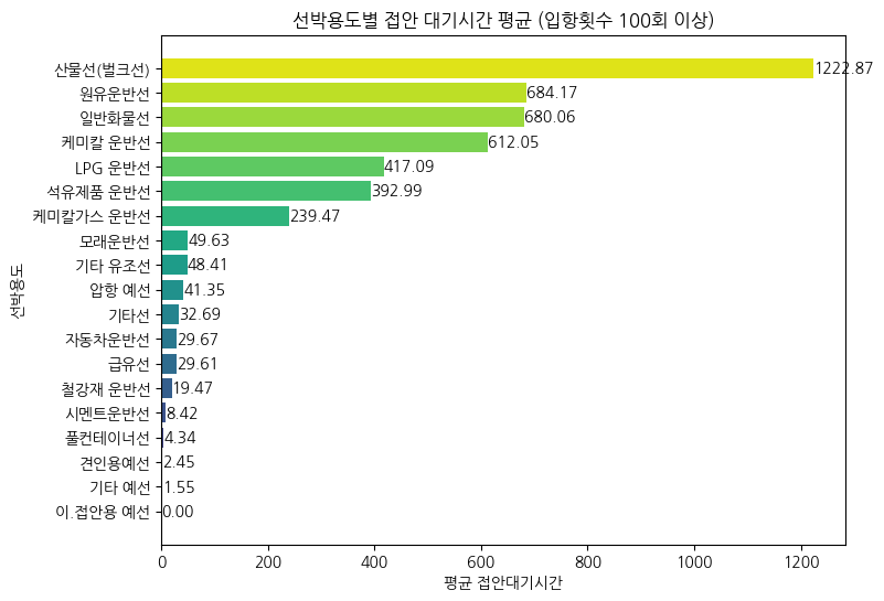
(3) 선박용도별 접안 대기시간 평균
# Filter out rows with counts less than 100
filtered_df = df.groupby('선박용도').filter(lambda x: len(x) >= 100)

# 선박용도별로 접안대기시간 계산
average_wait_time_by_purpose = filtered_df.groupby('선박용도')['접안_대기시간_분'].mean().reset_index()
average_wait_time_by_purpose = average_wait_time_by_purpose.sort_values(by='접안_대기시간_분', ascending=True)

# 청록색 계열의 색상 설정
colors = sns.color_palette('viridis', len(average_wait_time_by_purpose))

# 그래프로 시각화
fig, ax = plt.subplots(figsize=(8, 6))
bars = ax.barh(average_wait_time_by_purpose['선박용도'], average_wait_time_by_purpose['접안_대기시간_분'], color=colors)
ax.set_title('선박용도별 접안 대기시간 평균 (입항횟수 100회 이상)')
ax.set_xlabel('평균 접안대기시간')
ax.set_ylabel('선박용도')

# 각 막대 위에 숫자 표시
for bar, value in zip(bars, average_wait_time_by_purpose['접안_대기시간_분']):
    ax.text(bar.get_width(), bar.get_y() + bar.get_height()/2, f'{value:.2f}', ha='left', va='center')

plt.show()
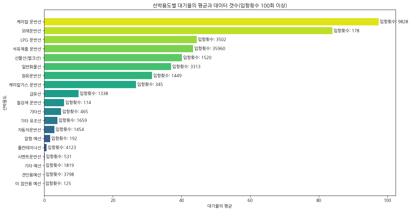
(4) 선박 용도별 대기율
# '선박용도'별 대기율의 평균 및 데이터 갯수 계산
average_waiting_rate_by_purpose = df.groupby('선박용도')['대기율'].agg(['mean', 'count']).reset_index()

# Filter out rows with '입항횟수' less than 100
average_waiting_rate_by_purpose = average_waiting_rate_by_purpose[average_waiting_rate_by_purpose['count'] >= 100]

# 내림차순 정렬
average_waiting_rate_by_purpose = average_waiting_rate_by_purpose.sort_values(by='mean', ascending=True)

# 청록색 계열의 색상 설정
colors = sns.color_palette('viridis', len(average_waiting_rate_by_purpose))

# 큰 크기의 수평 막대 그래프 그리기
plt.figure(figsize=(15, 8))
bars = plt.barh(average_waiting_rate_by_purpose['선박용도'], average_waiting_rate_by_purpose['mean'], color=colors)

# 데이터 갯수 표시
for bar, count in zip(bars, average_waiting_rate_by_purpose['count']):
    plt.text(bar.get_width(), bar.get_y() + bar.get_height() / 2, f' 입항횟수: {count}', ha='left', va='center')

plt.xlabel('대기율의 평균')
plt.ylabel('선박용도')
plt.title('선박용도별 대기율의 평균과 데이터 갯수(입항횟수 100회 이상)')
plt.show()
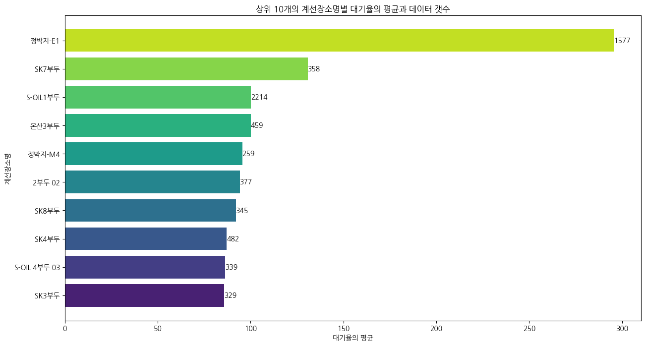
(5) 계선장소별 대기율 평균
👉 액체화물과 관련된 부두가 상위에 랭크
👉 정박지-E1은 정보를 찾을 수 없음(임시로 대기하는 곳으로 추정 중)
import matplotlib.pyplot as plt
import seaborn as sns  # Import seaborn for color palettes

# '계선장소명'별 대기율의 평균 및 데이터 갯수 계산
waiting_rate_by_location = df.groupby('계선장소명')['대기율'].agg(['mean', 'count']).reset_index()

# 내림차순 정렬
waiting_rate_by_location = waiting_rate_by_location.sort_values(by='mean', ascending=True)

# 상위 10개만 선택
top_10_locations = waiting_rate_by_location.tail(10)

# 청록색 계열의 색상 설정
colors = sns.color_palette('viridis', len(top_10_locations))

# 큰 크기의 수평 막대 그래프 그리기
plt.figure(figsize=(15, 8))  # Adjust the figure size as needed
bars = plt.barh(top_10_locations['계선장소명'], top_10_locations['mean'], color=colors)

# 데이터 갯수 표시
for bar, count in zip(bars, top_10_locations['count']):
    plt.text(bar.get_width(), bar.get_y() + bar.get_height() / 2, f'{count}', ha='left', va='center')

plt.xlabel('대기율의 평균')
plt.ylabel('계선장소명')
plt.title('상위 10개의 계선장소명별 대기율의 평균과 데이터 갯수')

plt.show()
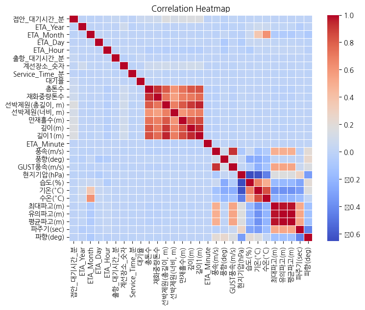
(6) 상관계수 히트맵과 수치
👉 전체적으로 0.2 이하의 수치를 보여, 액체화물 / 비액체화물로 나누어 상관분석 재 진행
👉 화물 용도 분류 후, 상관계수의 상승 확인
# 숫자로만 구성된 열을 뽑아 새로운 데이터 프레임 생성
new_df = df.select_dtypes(include=['float64', 'int64'])

# 열 재배치
column_order = ['접안_대기시간_분'] + [col for col in new_df if col != '접안_대기시간_분']
new_df = new_df[column_order]

# 상관행렬 생성
correlation_matrix = new_df.corr()

# 히트맵 그리기
plt.figure(figsize=(8, 6))
sns.heatmap(correlation_matrix, annot=False, cmap='coolwarm', linewidths=.5)
plt.title('Correlation Heatmap')
plt.show()
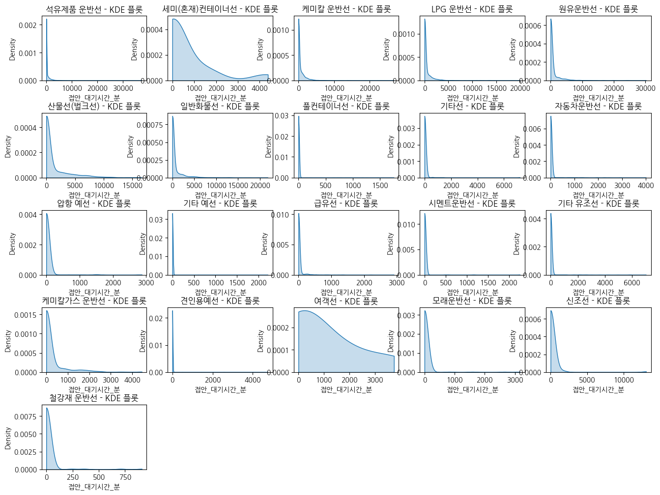
(7) 선박용도에 따른 대기시간 분포
👉 화물 용도 분류가 유의미한지 확인하기 위해 용도별 접안 대기시간 분포를 Kde plot으로 확인
👉 대기시간이 발생하지 않는 건수가 80%인 점을 감안하였을 때 3개 정도의 모양을 확인 =>> 화물용도별 구분 결정
new_df = df[df['접안_대기시간_분'] != 0]

# 선박용도에 따른 접안 대기시간 분포 파악
plt.figure(figsize=(16, 12))
plt.subplots_adjust(hspace=0.5)

for i, ship_type in enumerate(new_df['선박용도'].unique(), 1):
    plt.subplot(5, 5, i)
    sns.kdeplot(data=df[df['선박용도'] == ship_type], x='접안_대기시간_분', fill=True, cut = 0)
    plt.title(f'{ship_type} - KDE 플롯')
    plt.xlabel('접안_대기시간_분')
    plt.ylabel('Density')

plt.show()
728x90
'Projects > ⛴️ Ship Waiting Time Prediction' 카테고리의 다른 글
| [선박 대기시간 예측] 파생변수 생성 + 선박 대기시간 예측 모델(LightGBM) (0) | 2023.12.15 |
|---|---|
| [선박 대기시간 예측] 시계열/선석 기반 EDA (0) | 2023.12.15 |
| [선박 대기시간 예측] 3차 전처리 : 울산항 모델용 데이터셋 도출(결측치 처리) (1) | 2023.12.15 |
| [선박 대기시간 예측] 2차 전처리 : 중복값 처리 (0) | 2023.12.15 |
| [선박 대기시간 예측] 1차 전처리 : PORT-MIS 항만 데이터 결합 (2) | 2023.12.15 |


